Profitability by Service Line
Overview
The Profitability by Service Line report provides encounter, income, and revenue at the Service Line level. It includes a comparison of financials against the previous year, a table view by service lines, and the payor mix by financial class.
Click image to view full size
Slicers
This report provides filtering options that let you create a set of data, giving you the option of viewing the precise data you want to view.
Entity
The entity drop-down lists all of the clinics, hospitals, and other entities that comprise your institution. You can choose to view all of those entities or select a single entity to view.
Patient type
The patient drops-down lists the ways a patient was seen, such as inpatient or outpatient emergency. The list will show the patient types used in your organization.
Discharge date range
The drop-down lets you choose a date range for your view. The default is the current rolling 12 months; other options include current month to date and previous month to date.
TIP: Use the dashboard tools to view, export, and sort the data; view data as table; and more.
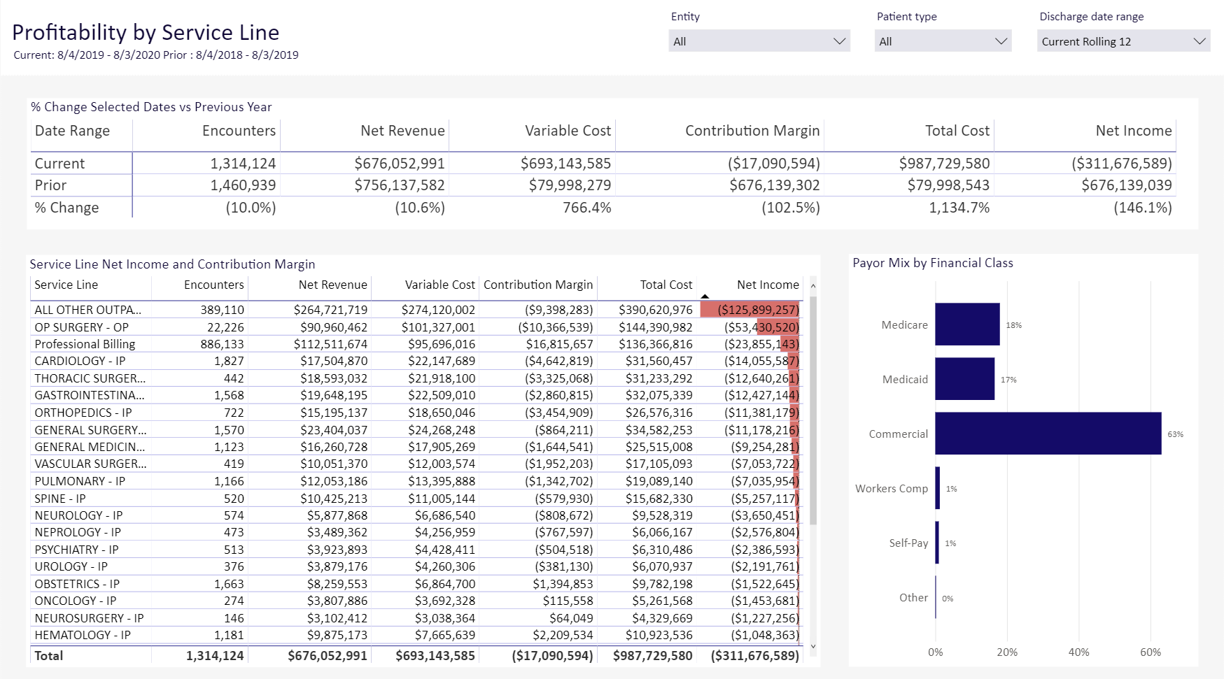
Percentage Change Selected Dates vs Previous Year
This section shows a high-level view of encounters, revenue, cost, and contribution margin for all service lines. It also shows the data for the previous year and the percentage change.
Click image to view full size
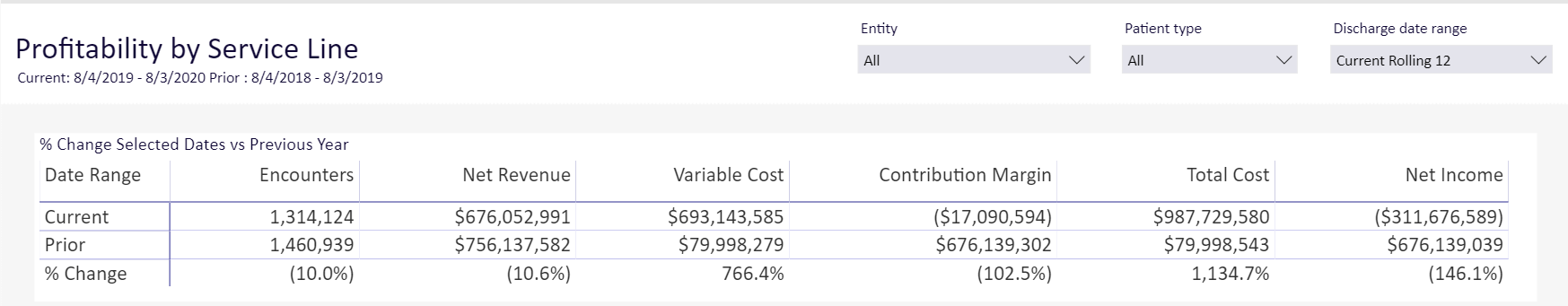
Service Line Net Income and Contribution Margin
This bar chart show the encounters and financials for each service line in your data set. When you select a row in this chart, the Payor Mix by Financial Class redisplays with data for that service line.
Click image to view full size
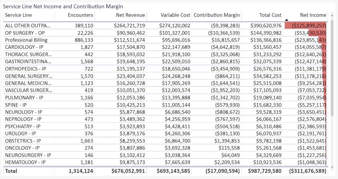
Payor Mix by Financial Class
This bar chart shows the payor mix for the service line(s) in your data set.
Click image to view full size
Navigation
-
Use the tabs at the bottom of the page to view other related reports in the category
-
Use the Navigation menu in the upper-left corner to return to Recent places that you've visited or to the Intelligence Center.